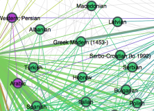
A tweet put me on to UNESCO’s Index Translationum – World Bibliography of Translation. It’s a list of books that have been translated from one language into another. I wondered if there was a way to use this to look at language similarity which took bilingualism into account. Essentially, if two languages are very different and there are few bilingual speakers, then there should be a lot of translations. If two languages are spoken bilingually by many people, then there should be less cause for translations. Of course, there economic, cultural and political factors, too, but let’s see how far we can get. Here’s a visualisation of the data using Gephi:
At first, some predictions are not borne out. There are 3616 publications translated from Spanish into Catalan, while there are 9244 publications from Spanish into English. This suggests that Spanish and Catalan are closer. Of course, there are only 12 publications translated from Spanish to Hindi, but it’s unlikely that this is being caused by a large Spanish-Hindi bilingual community. That is, low numbers could mean no need to translate because of language similarity, or that there is no economic or cultural incentive for translating between them (or lack of data).
Still, we can put the translation matrix into a clustering algorithm and create a cluster diagram. Using the inverse of the (log) number of publications as a distance measure (so that languages with lots of translated books are closer), we get some sensible clusterings:

The top of the tree is quite flat, due to lack of data. However, lower down things make more sense. Lithuanian and Latvian cluster together as do Herbew and Yiddish. In the context of this dataset, the clustering of (Korean, Japanese, Chinese) and (Norwegian, Swedish, Danish) make sense, too.
The cluster diagram using number of translations as a distance measure (so that languages with lots of translated books are further away) makes less sense. Here’s the cluster diagram of the top 20 languages (by source/target publications):

I’m not really sure how to interpret this. Is there a big Polish-Chinese bilingual community? I doubt it.
There are several things that could be improved: Taking account of directionality, geographic distance or economic factors (e.g. exports) and so on. Still, it provides another way to think about how languages are related. For some other visualisations, see my post on visualising languages through phonetic distance and Richard’s post on heat maps in WALS.