I’m currently writing an article on the relationship between language and social features of the speakers who use it. As studies such as Lupyan & Dale (2010) have discovered, language structure is partially determined by social structure. However, it’s also probable that many social features of a community are determined by its language.
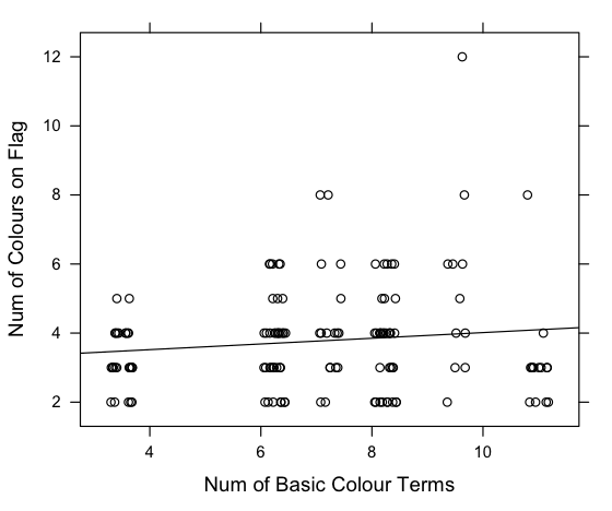
Today, I wondered whether the number of basic colour terms a language has is reflected in the number of colours on its country’s flag. The idea being that a country’s flag contains colours that are important to its society, and therefore a country with more social tools for discussing colour (colour words) will be more likely to put more colours on its flag. It was a long shot, but here’s what I found:
The World Atlas of Language Structures has data on the number of basic colours in many languages (Kay & Maffi, 2008). Wikipedia has a list of country flags by the number of colours in them. Languages with large populations (like English, Spanish etc.) were excluded. It’s known that the number of basic colour terms correlates with latitude, so a partial correlation was carried out. There was a small but significant relationship between the number of colour terms in a langauge and the number of colours on the flag where that language is spoken (r = 0.15, τ = 254, p=0.01, partial correlation, 2-tailed using Kendall’s tau).
Here’s the flag of Belize, where Garífuna is spoken (9-10 colours in the language, 12 colours on the flag):

Here is the flag of Nigeria where Ejagham is spoken (3-4 colours in the langauge, 2 colours on the flag):

Interestingly, the languages with the highest number of colours in their language and flag come from Central America while the majority of the languages with the lowest number of colours in their language and flag come from Africa. Maybe there’s some cultural influence on neighbouring flags.
Update:
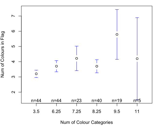
Here’s a boxplot, which makes more sense:
Also, I re-ran the analysis taking into account distance from the equator, speaker population and some properties of the nearest neighbour of each language (number of colours on flag and number of basic colours in langauge). A multiple regression showed that the number of basic colours in a language is still a significant predictor of the number of colours in its national flag (r = 0.12, F(106,16)=1.8577, p= 0.03). This analysis was done by removing languages with populations more than 2 standard deviations from the mean (9 languages out of 140). The relationship is still significant with the whole dataset.
There are still problems with this analysis, of course. For example, many of the languages in the data are minority languages which may have little impact on the national identity of a country. Furthermore, the statistics may be compromised by multiple comparisons, since there may be a single flag for more than one language. Also, a proper measure of the influence of surrounding languages would be better. The nearest neighbour was supposed to be an approximation, but could be improved.
Lupyan G, & Dale R (2010). Language structure is partly determined by social structure. PloS one, 5 (1) PMID: 20098492
Kay, Paul & Maffi, Luisa. (2008). Number of Basic Colour Categories.In: Haspelmath, Martin & Dryer, Matthew S. & Gil, David & Comrie, Bernard (eds.) The World Atlas of Language Structures Online. Munich: Max Planck Digital Library, chapter 133.


I guess you already had your fun getting the information out of the Wikipedia page, but anyway here’s another ready-to-use (although somewhat outdated) data set with flag color information per country:
http://archive.ics.uci.edu/ml/machine-learning-databases/flags/
Also, what on earth is going on on the x-axis??? Is that to make up for the latitude-correlation (and to sneakily get rid of tons of ties in the process)? Shouldn’t other correlations be taken into account as well? (color terms – speakers seems a pretty obvious one, although that’s just a guess..)
I knew there’d be a ready-made database somewhere!
The data is jittered for the graph to make it a bit clearer. I could have used a boxplot, I guess. The data for the analysis was not jittered, so you’re right that there are a lot of ties. That’s why I used Kendall’s Tau (It’s also significant for using Spearman and Person methods).
You’re right about population being a factor, and probably dispersion, and industrialisation, too. However, the majority of the languages in this sample are fairly low populations. This isn’t supposed to be completely serious, however!
Ah ok, well I don’t think that the fact that none of the data points on an integer-integer plot actually fall on a whole number (as is clearly visible for 6 and 8 where all data points are actually to the right of the mark) aids in making the graph any clearer 😀 Boxplots all the way! What’s the motivation behind excluding high-population languages by the way, and how would including them alter the results? Significant or not, I think that .15 isn’t really that impressive to begin with :>
I’ve updated some stuff – see the article. The idea behind the outlier removal was to avoid langauges with very many speakers which might be a sign of a lingua franca or industrialisation, but I’ll have to re-think this argument. One of the languages was an outlier by many orders of magnitude. The relationship is still there in the whole dataset, though.
You’re right that the correlation is measly, but it’s interesting that there’s anything there at all!