This is a side project I’ve been working on with Rory Turnbull and Alexis Palmer I recently presented a paper with the same title at the European Association of Computational Linguistics conference, in the Visualisation of Linguistic Patterns Workshop in Avignon (You can read about another paper presented by Gerhard Jäger in this workshop here in Sean’s post). We’ve set up an email group and a website (still a work in progress) after the conference for people wanting to explore language visualisation – hopefully, if you like this or Sean’s post you’ll join us. You can download my paper here, and the slides are available here.
With that having been said, let’s start.
This project is basically preoccupied with understanding how we can use human pattern finding abilities to deal with data where a machine or statistical analysis doesn’t help. Put another way, is there a way of showing language relatedness easily without relying on statistical techniques? And finally, can we use those visualisations to cut down on research time, and to illuminate new areas of research? We tried to approach this problem by using pixel or heat maps on WALS data. As far as we know, this is the first published paper looking at language typology, geography, and phylogeny altogether in one (although there is another paper coming out soon from Michael Cysouw’s ‘Quantitative Language Comparison’ group using similar techniques.) There are other lines of research in this vein, though. One line of recent work brings computational methods to bear on the formation and use of large typological databases, often using sophisticated statistical techniques to discover relations between languages (Cysouw, 2011; Daumé III and Campbell, 2007; Daume ́ III, 2009, among others), and another line of work uses typological data in natural language processing (Georgi et al., 2010; Lewis and Xia, 2008, for example). We are also aware of some similar work (Mayer et al., 2010; Rohrdantz et al., 2010) in visualising dif- ferences in linguistic typology, phylogeny (Mul- titree, 2009), and geographical variation (Wieling et al., 2011). Here, we just try to combine these as well as we can.
How Sparse is WALS?
The World Atlas of Language Structures has information for 2,678 languages, which is roughly a third of the amount of languages in the world – so, not bad. There are 144 available features – in the actual database, which is freely available, there are actually 192 available feature options. However, only 16% of this 2678 x 192 table is actually filled. Here’s a pretty graph (made before breakfast by Rory).

You can see the ocean at the top of the graph above – clearly New Guinea. Each of these languages is shown by their geographical coordinates. You can also see how good each language is represented in WALS by the size of the circles. We couldn’t use all of these languages as there weren’t enough features to display in a graph. So we cut down WALS to 372 languages that all had at least 30% of their features filled. We then used two different approaches to decide which languages to place near each other in a graph.
Geographically Centred Visualisation

One of those approaches, seen above, was to draw a 500km radius around each language, and see how many languages fit in that ring, post-cleaning. There were surprisingly little rings that had enough to fill the graph above – we ended up with around six for the amount of cleaning we did, and even here, above, you can see white spaces where there is no value for that feature for that language. After drawing this ring, we took the centre language – here, Yimas, a Trans New Guinean language – and put the closest language next to it, and then the next closest next to it on the other side, and so on. This is a problem – it means that languages close to each other might be in a totally different cardinal direction – a northern language that is 500 km away from Yimas might be situated next to a southern one. So, for these graphs, you have more pattern-seeking success if you look at the languages in the middle.
Another problem was that the colours don’t actually correspond to anything except within their feature line – so, that there is so much green here doesn’t mean that the features are related – just that many languages share similar correspondances. A final problem was that the selection of features from WALS may seem a bit random – we selected those that fit most. Now, having said those disclaimers, we can still see some cool features in these graphs.
For instance, You’ll notice the red square in the adjectival ordering features. It looks like Kewa, Alambak, Hua and Yagara might be related, either geographically or phylogenetically, as they share that feature. However, if we look at the top stripe, we can see that Alambak is blue, while the others are all orange. This stripe is meant to show language family – so, Alambak is not phylogenetically related. It is possible that it has been influenced by it’s neighbours, then. If you’re interested, here are the language family of the languages in that column: Pink = Border; Red = Trans-New Guinea; Blue = Sepik; Brown = Lower Sepik-Ramu; Purple = Torricelli; Green = Skou; and Orange = Sentani.
Another cool thing one can see in these graphs is checkerboard patterns, like is almost seen in the negative morpheme feature lines. When a feature regularly avoids the other, it shows some sort of negative correspondance. The opposite would be true for features that regularly co-occur.
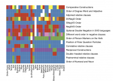
Phylogenetic Centred Visualisation

In order to not just focus on geography, we also did a couple of graphs looking at phylogenetic relations. So, the one above is of the Niger-Congo family, arranged from west to east, because that looked like the most obvious way to plot them, after looking at the geographical relations on WALS – there was less distances between languages on a north to south line than from west to east. These are all in one family, so there’s no bar at the top.
There’s some pretty fun stuff to draw from this graph, too. For instance, not all features have the same diversity. Comparative constructions are a lot more variable than the order of the numeral and the noun. Second, you can see pretty interesting clusters. For instance, the top left seems to cluster quite a bit, as does the bottom right. That means that languages to the west and languages to the east are more like their neighbours, which is expected. Remember that the colours are arbitrary per feature, so the most interesting clusters are defined by not being too noisy, like we see in the top right.
There’s at least one interesting thing to take away from this graph. For Bambara and Supyire, we see clusters of shared features. Given the importance of Bambara for syntactic argumentation – it was one of the languages that challenged the Chomskyan language hierarchy by being shown to follow a context-sensitive grammar (Culy, 1985) – this means that it might be worth looking into Supyire for the same phenomena. And that is the entire point of these visualisations – finding ways of finding research easier, without depending too much on the poor stats that can be scraped from sparse databases.
Future Work
So, what I’d like to do now is keep running with this idea. Hopefully, this means working with Ethnologue, Multitree for better phylogenetic relations, with Wikipedia for better geographical coordinates, and with WALS more closely for better picking of features and languages. If you have any comments or suggestions, I’d love to hear them.
References
- Christopher Culy. 1985. The complexity of the vocabulary of Bambara. Linguistics and Philosophy, 8:345–351. 10.1007/BF00630918.
- Michael Cysouw. 2011. Quantitative explorations of the world-wide distribution of rare characteristics, or: the exceptionality of northwestern european languages. In Horst Simon and Heike Wiese, editors, Expecting the Unexpected, pages 411–431. De Gruyter Mouton, Berlin, DE.
- Hal Daume ́ III and Lyle Campbell. 2007. A Bayesian model for discovering typological implications. In Conference of the Association for Computational Linguistics (ACL), Prague, Czech Republic.
- Hal Daume ́ III. 2009. Non-parametric Bayesian model areal linguistics. In North American Chapter of the Association for Computational Linguistics (NAACL), Boulder, CO. Matthew Dryer and Martin Haspelmath, editors. 2011.
- The World Atlas of Language Structures Online. Max Planck Digital Library, Munich, 2011 edition.
- Michael Dunn, Simon Greenhill, Stephen Levinson, and Russell Gray. 2011. Evolved structure of language shows lineage-specific trends in word-order universals. Nature, 473(7345):79–82.
- Ryan Georgi, Fei Xia, and Will Lewis. 2010. Comparing language similarity across genetic and typologically-based groupings. In Proceedings of COLING 2010.
- William Lewis and Fei Xia. 2008. Automatically identifying computationally relevant typological features. In Proceedings of IJCNLP 2008.
- M. Paul Lewis, editor. 2009. Ethnologue: Languages of the World. SIL International, Dallas, TX, six- teenth edition.
- Richard Littauer, Rory Turnbull, Alexis Palmer (2012). Visualising Typological Relationships: Plotting WALS with Heat Maps. In Proceedings of the European Association of Computational Linguistics 2012 Workshop on the Visualization of Linguistic Patterns. Avignon, France, 23-24 April, 2012.
- Thomas Mayer, Christian Rohrdantz, Frans Plank, Peter Bak, Miriam Butt, and Daniel Keim. 2010. Consonant co-occurrence in stems across languages: automatic analysis and visualization of a phonotactic constraint. In Proceedings of the 2010 Workshop on NLP and Linguistics: Finding the Common Ground, NLPLING ’10, pages 70–78, Stroudsburg, PA, USA. Association for Computa- tional Linguistics.
- Multitree. 2009. Multitree: A digital library of language relationships. Institute for Language Information and Techology (LINGUIST List), Eastern Michigan University, Ypsilanti, MI, 2009 edition.
- Christian Rohrdantz, Thomas Mayer, Miriam Butt, Frans Plank, and Daniel Keim. 2010. Comparative visual analysis of cross-linguistic features. In Proceedings of the International Symposium on Visual Analytics Science and Technology (EuroVAST 2010), pages 27–32. Poster paper; peer-reviewed (abstract).
- Martijn Wieling, John Nerbonne, and R. Harald Baayen. 2011. Quantitative social dialectology: Explaining linguistic variation geographically and socially. PLoS ONE, 6(9):e23613, 09.
1 thought on “Visualising Language Typology – Plotting WALS with Heat Maps”